Corner Radius, Shadows, and Borders in Swift
Learn how to apply a corner radius, shadow, and border to all kinds of views, including UIViews, UIButtons, and UIImageViews, in Swift.


Rounding corners, adding shadows, and drawing borders are a common way to differentiate UI elements and make an iOS application’s design stand out. This post presents examples of how to apply a corner radius, shadow, and border to a view in Swift:
- Corner Radius
a. layer.cornerRadius
b. Rounding Top-Left, Top-Right, Bottom-Left, and Bottom-Right Corners Separately
c. @IBDesignable, @IBInspectable Corner Radius
d. Corner Radius In Storyboard
e. Examples of UIView, UIButton, UIImageView With Rounded Corners - Shadows
a. layer.shadow Properties
b. @IBDesignable, @IBInspectable Shadow
c. Shadow In Storyboard
d. Examples of UIView, UIButton, UIImageView With A Shadow - Borders
a. layer.border Properties
b. @IBDesignable, @IBInspectable Border
c. Border In Storyboard
d. Examples of UIView, UIButton, UIImageView With A Border - Solutions To Common Problems
a. Shadows And Rounded Corners At The Same Time
b. UIImageView Shadows With Content Mode [Aspect Fill, Center, etc]
Corner Radius
layer.cornerRadius
Rounding all corners on a UIView can be implemented by setting the cornerRadius property on the view’s layer:
view.layer.cornerRadius = 5.0
Rounding Top-Left, Top-Right, Bottom-Left, and Bottom-Right Corners Separately
Sometimes rounding on only certain corners of a view is desirable. To set the corner radius for only some corners, use UIBezier to create a mask path specifying the UIRectCorner that should be rounded:
// Specify which corners to round
let corners = UIRectCorner(arrayLiteral: [
    UIRectCorner.topLeft,
    UIRectCorner.topRight,
    UIRectCorner.bottomLeft,
    UIRectCorner.bottomRight
])

// Determine the size of the rounded corners
let cornerRadii = CGSize(
    width: cornerRadius,
    height: cornerRadius
)

// A mask path is a path used to determine what
// parts of a view are drawn. UIBezier path can
// be used to create a path where only specific
// corners are rounded
let maskPath = UIBezierPath(
    roundedRect: view.bounds,
    byRoundingCorners: corners,
    cornerRadii: cornerRadii
)

// Apply the mask layer to the view
let maskLayer = CAShapeLayer()
maskLayer.path = maskPath.cgPath
maskLayer.frame = view.bounds

view.layer.mask = maskLayer
@IBDesignable, @IBInspectable Corner Radius
An @IBDesignable UIView extension marking the cornerRadius property as @IBInspectable can be implemented to allow a corner radius to be set in a Storyboard:
@IBDesignable extension UIView {
    @IBInspectable var cornerRadius: CGFloat {
        get { return layer.cornerRadius }
        set {
              layer.cornerRadius = newValue

              // If masksToBounds is true, subviews will be
              // clipped to the rounded corners.
              layer.masksToBounds = (newValue > 0)
        }
    }
}
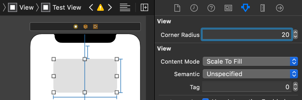
Corner Radius In Storyboard
Implementing the @IBDesignable UIView extension and applying the @IBInspectable modifier to the cornerRadius property allows a view’s corner radius to be set in a Storyboard’s Attributes Inspector:
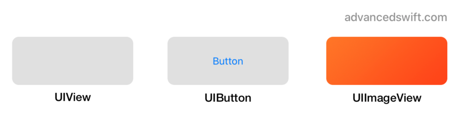
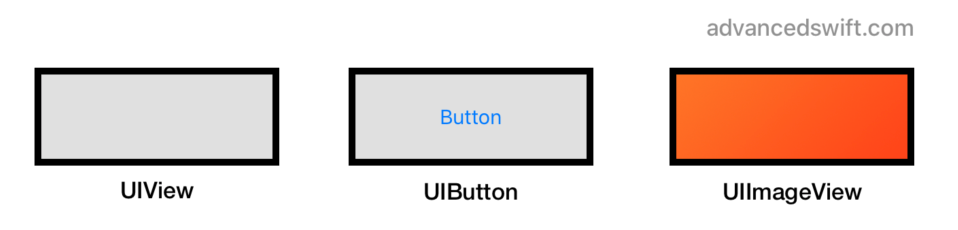
Examples of UIView, UIButton, UIImageView With Rounded Corners
Shadows
layer.shadow Properties
Adding a shadow to a UIView can be implemented by setting the shadowColor, shadowOpacity, shadowOffset, and shadowRadius properties on the view’s layer:
view.layer.shadowColor = UIColor.black.cgColor
view.layer.shadowOpacity = 0.2
view.layer.shadowOffset = CGSize(width: 4, height: 4)
view.layer.shadowRadius = 5.0

// Set masksToBounds to false, otherwise the shadow
// will be clipped and will not appear outside of
// the view’s frame
view.layer.masksToBounds = false
@IBDesignable, @IBInspectable Shadow
An @IBDesignable UIView extension marking the shadow properties as @IBInspectable can be implemented to allow view shadows to be configured in a Storyboard:
@IBDesignable extension UIView {
    @IBInspectable var shadowRadius: CGFloat {
        get { return layer.shadowRadius }
        set { layer.shadowRadius = newValue }
    }

    @IBInspectable var shadowOpacity: CGFloat {
        get { return CGFloat(layer.shadowOpacity) }
        set { layer.shadowOpacity = Float(newValue) }
    }

    @IBInspectable var shadowOffset: CGSize {
        get { return layer.shadowOffset }
        set { layer.shadowOffset = newValue }
    }

    @IBInspectable var shadowColor: UIColor? {
        get {
            guard let cgColor = layer.shadowColor else {
                return nil
            }
            return UIColor(cgColor: cgColor)
        }
        set { layer.shadowColor = newValue?.cgColor }
    }
}
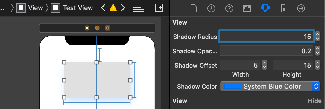
Shadow In Storyboard
By implementing the @IBDesignable UIView extension and applying the @IBInspectable modifier to the shadow properties, a view’s shadow to be set in a Storyboard’s Attributes Inspector:
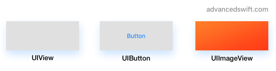
Examples of UIView, UIButton, UIImageView With A Shadow
Borders
layer.border Properties
Adding a border to a UIView can be implemented by setting the borderColor and borderWidth properties on the view’s layer:
view.layer.borderColor = UIColor.black.cgColor
view.layer.borderWidth = 2
@IBDesignable, @IBInspectable Border
An @IBDesignable UIView extension marking the border properties as @IBInspectable can be implemented to allow view borders to be configured in a Storyboard:
@IBDesignable extension UIView {
    @IBInspectable var borderColor: UIColor? {
        get {
            guard let cgColor = layer.borderColor else {
                return nil
            }
            return UIColor(cgColor: cgColor)
        }
        set { layer.borderColor = newValue?.cgColor }
    }

    @IBInspectable var borderWidth: CGFloat {
        get {
            return layer.borderWidth
        }
        set {
            layer.borderWidth = newValue
        }
    }
}
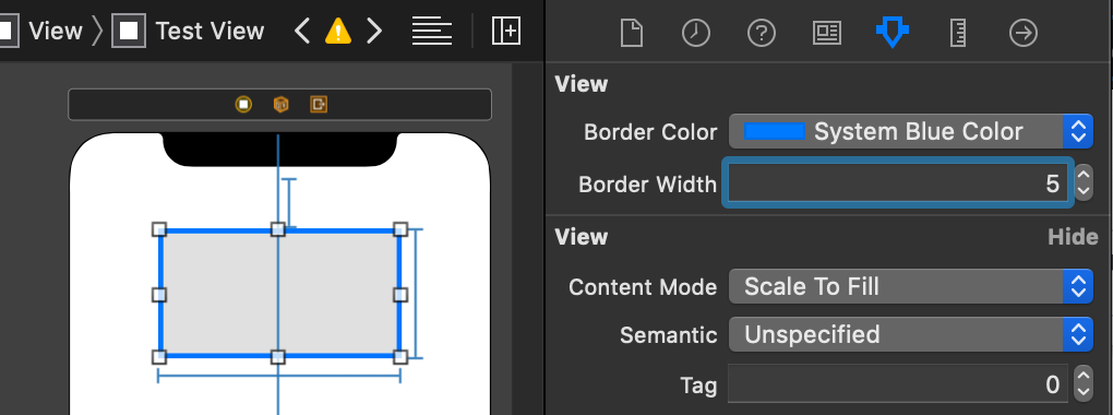
Border In Storyboard
By implementing the @IBDesignable UIView extension and applying the @IBInspectable modifier to the border properties, a view’s border to be set in a Storyboard’s Attributes Inspector:
Examples of UIView, UIButton, UIImageView With A Border
Solutions To Common Problems
Shadows And Rounded Corners At The Same Time
One challenge with shadows and rounded corners are subviews. Clipping subviews, for example using masksToBounds, is necessary for rounded corners to cut off subviews. However, clipping prevents the shadow from drawing:
One solution is to create a view container that will only draw the shadow, and another view contentView that will clip subviews to rounded corners:
let contentView = UIView()
contentView.layer.cornerRadius = 5.0
contentView.layer.masksToBounds = true

let container = UIView()
container.layer.cornerRadius = 5.0
container.layer.masksToBounds = false

container.layer.shadowColor = UIColor.black.cgColor
container.layer.shadowOffset = CGSize(width: 4, height: 4)
container.layer.shadowOpacity = 0.2
container.layer.shadowRadius = 5.0

contentView.frame = container.bounds
contentView.autoresizingMask = [
    .flexibleWidth, .flexibleHeight
]

container.addSubview(contentView)
UIImageView Shadows With Content Mode [Aspect Fill, Center, etc]
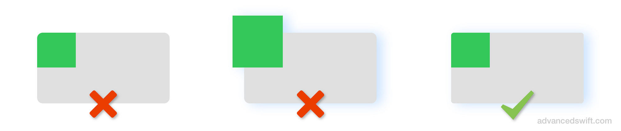
Shadows are drawn outside of a view’s bounds, meaning clipToBounds and the view’s layer masksToBounds properties must be false for the shadow to be visible.
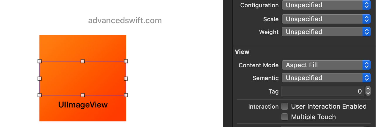
A UIImageView with contentMode set to .aspectFill, .center, and others will draw the image outside of the UIImageView bounds if clipToBounds is false. Example (the outline is the bounds of the image view):
The solution is the same as presented in the Shadows And Rounded Corners At The Same Time section, except that the imageView is the contentView in the provided code example.
Corner Radius, Shadows, and Borders in Swift
That’s it! By using the appropriate layer properties on a UIView, you can apply a corner radius, shadow, and border to views, buttons, tables, images, and all other views in Swift.